
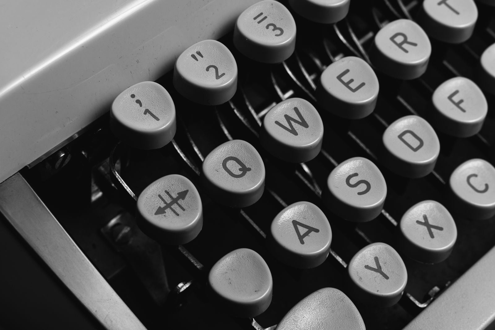
In a Milwaukee workshop in 1868, a former newspaper editor named Christopher Latham Sholes filed a patent for a machine he called the “Type-Writer.” The keys were arranged alphabetically across two rows, which seemed the obvious choice: letters in the order everyone already knew. It did not work. When a typist struck two neighbouring keys in quick succession, the slender metal typebars — the arms that swung up to strike the paper through an inked ribbon — collided and jammed against each other before they could fall back into place. The machine could type, but only slowly, and only if the operator was careful never to build up a rhythm.
Sholes spent the next six years rearranging the keys. By the time E. Remington and Sons began manufacturing his design in 1874, the alphabetical rows were gone. In their place sat the layout that would eventually be printed on almost every keyboard in the world: Q, W, E, R, T, Y. The letters most likely to appear together in English — “t” and “h,” “s” and “t,” “e” and “d” — had been pushed to opposite sides of the keyboard, so their typebars would swing from different directions and not tangle in the middle. The layout was, in effect, a mechanical workaround, disguised as a design decision.
A machine that had to be tamed
Sholes’s early prototypes are documented in the Smithsonian’s collection of the Sholes and Glidden typewriter, the first commercial model built by Remington. The mechanism was unforgiving. Each key was linked by a wire lever to a typebar hinged at the bottom of a circular “basket.” When a key went down, its typebar swung up and struck the ribbon at a single point above the platen. If two adjacent bars were fired within a fraction of a second, the second one would smash into the first before it had returned to rest. The typist had to stop, reach in, and separate the bars by hand.
The obvious solution was to make sure adjacent bars were rarely fired in sequence. That meant studying which letters tended to follow which — the digraphs of English — and physically separating them. According to a detailed Smithsonian analysis of the layout’s origins, Sholes worked with the educator Amos Densmore, whose brother James was Sholes’s business partner, to identify common letter pairs and space them apart on the basket. The result was not random. It was a deliberate anti-collision arrangement, and it was called QWERTY only because those happened to be the first six letters on the top row.
“Designed to slow typists down” — with an asterisk
The popular version of this story, repeated in countless trivia columns, is that Sholes wanted to slow typists down. That is not quite right, and it matters. Sholes did not want people typing slowly; he wanted them typing fast without jamming his machine. The layout was engineered to prevent mechanical failure at speed, which is a subtly different goal. A skilled operator on an 1874 Remington could reach a respectable pace precisely because the keys had been laid out to let them.
Researchers Koichi Yasuoka and Motoko Yasuoka at Kyoto University pushed the story further in a 2011 paper, “On the Prehistory of QWERTY,” which traced the layout’s evolution through Sholes’s patents and correspondence. They argue QWERTY was shaped less by typists than by the earliest professional users of the typewriter: telegraph operators transcribing Morse code in real time. Certain letter groupings — the placement of “S” next to “E,” for instance — make more sense as accommodations for how Morse operators decoded incoming signals than as ergonomic choices for touch typing, which had not yet been invented.
Why it never changed
By the 1890s the mechanical problem QWERTY was designed to solve had largely been engineered away. Newer typewriters used lighter typebars, better return springs, and eventually type balls and daisy wheels that could not jam at all. Electric typewriters and then computers dispensed with the physical bars entirely. The keyboard on a modern laptop has no more reason to be arranged in QWERTY than a car has to have a whip socket. And yet it is.
The reason is a textbook case of what economists call path dependence — sometimes described as a QWERTY effect after Paul David’s 1985 paper on the subject. Millions of people had learned to touch-type on QWERTY machines. Every typing school taught it. Every office bought keyboards that matched what secretaries already knew. When August Dvorak patented a rival layout in 1936, with vowels on the home row and the most common consonants placed for alternating hands, the ergonomic case was strong but the switching cost was ruinous. Studies since have found modest speed advantages for Dvorak but nothing large enough to overcome a century of muscle memory and installed base.
The same lock-in shows up elsewhere in the history of technology. Rail gauges, video cassette formats, and the layout of city streets all carry the fingerprints of decisions made under constraints that no longer apply. QWERTY is unusual mainly because almost everyone who has ever used a computer has felt it under their hands. For a broader look at how one bad decision can ripple outward for years, see how a single mistyped command by one AWS engineer knocked a huge slice of the internet offline for nearly four hours.
The layout on your phone
The strangest legacy of Sholes’s typebar problem is what happened when keyboards stopped being mechanical altogether. When BlackBerry, then Apple, then every Android manufacturer designed touchscreen keyboards for phones in the 2000s, they had a genuinely blank slate. There were no typebars. There was no basket. The screen could show any arrangement of letters the designers wanted, and could even change it based on context. They chose QWERTY.
The reasoning was pragmatic: users already knew it. A phone keyboard that required relearning would have failed in the market regardless of how much more efficient it might have been. So the arrangement Sholes settled on to keep 1870s metal arms from colliding is now etched into the glass of roughly six billion smartphones. The commonly paired letters are still spread apart — “t” on the top row, “h” on the home row — for no reason at all, other than that they always have been.
It is one of the quieter examples of how technology remembers its own history. The machine that needed the compromise is long gone. The compromise remains, pressed against every thumb.