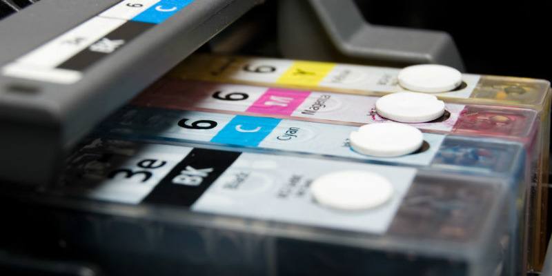
It’s no secret that printer manufacturers don’t actually make their money on the printers themselves. Instead, their profits lie in the ink and toner that those printers consume. A couple of years ago the Internet went crazy for a middle-school student who conducted an experiment with font types in an effort to find which was the most economical. His findings led him to claim that the US government could save half a billion dollars a year in printing costs if it simply switched fonts. While his proposed font, Garamond, does indeed consume less ink, it isn’t nearly as legible at smaller font sizes. Thus the font size would have to increase, increasing the amount of ink used as well.
While the student’s claims weren’t entirely true, it still got people thinking about the amount of ink particular fonts use. Some fonts are designed to consume less ink than others, but which ones? When it comes to choosing a font with the specific goal of saving ink (and money), size definitely matters. Think about it. The smaller the surface area of the font, the less ink it uses. So how do you know which fonts have smaller surface areas? Look for terms like Thin, Condensed or Narrow, as they usually denote more economical fonts. Simple fonts also tend to be less ink hungry. Fonts with lots of flourishes, like little squiggles that hang off the ends of letters, generally chew up more ink.
If you need a place to start, consider using the following fonts.
1. Century Gothic
Century Gothic is criminally overlooked. The font is clear and easy to read while being economical at the same time. In addition the design is simplistic and sans serif, meaning it foregoes any distracting curlicues, . The only real downside to Century Gothic is that the font is wide set, taking up more room on the page. While you will save on ink and toner with Century Gothic, you will find that you will chew through more paper to do so.

2. Ecofont
We can only assume that the developers of Ecofont took their inspiration from Swiss Cheese. The typeface employs small holes in every letter. Due to ink bleeding, the holes are nearly indistinguishable once they’re printed on the page, provided it’s a relatively small font size. The holes start to become visible around 12-point and become even more pronounced as the font size increases. Ecofont is available in a variety of different packages, with the single lifetime license running $19.95.

3. Courier
Courier’s simplistic retro look is due to the fact that it was originally designed for typewriters. In an effort to save typewriter ink ribbon, the font employs thin lettering. Fonts like Garamond also employ thin lettering, but where Courier trumps the competition is the fact that it remains legible at smaller sizes. Courier may not be the most fancy-looking font on this list, but it will help your ink and toner go the extra mile.

4. Ryman Eco
Created by Ryman Stationery, an office supply chain in the UK, the Ryman Eco font is free and uses 33% less ink than “standard fonts.” The method of ink conservation is similar to that of Ecofont. By using hollow letters, Ryamn Eco uses considerably less ink without sacrificing readability. In fact, at smaller fonts the hollow letters are negligible due to ink bleed. The hollow letters are only noticeable at larger font sizes, but even still Ryman Eco is pleasing to the eye.

5. Times New Roman
Believe it or not, the font that happens to be the default for many people is actually fairly efficient when it comes to ink consumption. In a study conducted by Consumer Reports, Times New Roman was determined to be about 27% more efficient than Arial, a common Times New Roman substitute. So, if changing your default font is too big of a change for you, you can take solace in knowing that sticking with Times New Roman isn’t going to break the bank.

Have you made the switch to any of these fonts? Have you found that you aren’t running out to your office supply store to buy ink cartridges as often? Do you have any other ink saving tips? Let us know in the comments!