

With tons of plugins and turnkey solutions out there, any webmaster can easily flip the switch and activate the mobile theme for their website. The problem is, how can the webmaster check out how his/her site look like on a mobile device, if he/she does not own a smartphone? Fret not, with a little trickery, you can easily use your desktop browser to access your site and make it think that you are using a mobile browser.
Every browser comes with its own user-agent. Most servers use the browser’s user-agent to determine where the user is from and serve the webpage accordingly. If it detects that the user is using a mobile browser, it will serve up the mobile theme (if the mobile theme is activated). By changing the user-agent of your desktop browser to that of a mobile browser, you can make the server think that you are using a mobile device.
Viewing mobile theme in Firefox
In Firefox, I recommend the User Agent Switcher addon as it comes pre-installed with the iPhone user-agent and you can switch to it easily.
After installing the extension and restarting your Firefox, go to “Tools -> Default User Agent -> iPhone“.
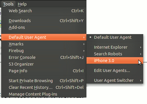
Now, refresh to your site and you should see the mobile theme in action.
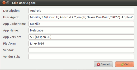
To add the Android agent to the list, go to “Tools -> Default User Agent -> Edit User Agents“.
Click the “New -> New User Agent” button and enter the following:
Description: Android
User Agent: Mozilla/5.0 (Linux; U; Android 2.2; en-gb; Nexus One Build/FRF50)
AppleWebKit/533.1 (KHTML, like Gecko) Version/4.0 Mobile Safari/533.1
The remaining entries you can keep them at default value.
(For iPad, the user agent is Mozilla/5.0 (iPad; U; CPU OS 3_2 like Mac OS X; en-us) AppleWebKit/531.21.10 (KHTML, like Gecko) Version/4.0.4 Mobile/7B334b Safari/531.21.10)
The next trick you need to know is the keyboard shortcut Ctrl + Shift + M. This keyboard shortcut turns your browser into a responsive window and you can drag to resize it to a specified screen resolution.
You can add new screen size to the list. For your reference:
iPhone 4 has a screen resolution of 960 x 640 (H by W, so you should enter 640 x 960)
iPhone 3GS and below has a screen resolution of 480 x 320 (H by W, so you should enter 320 x 480)
Nexus One (Android) has a screen resolution of 800 x 480 (H by W, so you should enter 480 x 800)
Once you have added the screen resolution, you can now view your website in its mobile suit and in the correct screen size, right on your desktop browser.
The above tricks can be repeated on other browsers such as Opera and Safari. Google Chrome does not allow you to change the user agent, so you won’t be able to use the above tricks.
How do you test your mobile theme?